
« nearly 1,000 photos in just 24 hours! | Main | the Gates through Central Park benches »
March 10, 2005
visualizing the archive
To begin discussing in earnest how we might visualize/organize the archive we are compiling, it seems like a good idea to do a quick survey of existing examples. I mention a few below, but to get this going, please point us to other examples, and comment on what we've mentioned here.
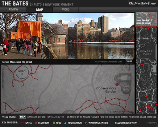
The most stunning visualization we've seen so far is the New York Times interactive feature, The Gates: Christo's New York Moment, designed by Ty Amhad-Taylor. In addition to a four-minute audio review by Times chief art critic Michael Kimmelman, the piece provides a fantastic map of the park with three possible views: a basic scheme with dotted lines tracing the path of the Gates, and two aerial photographs, before the Gates and after. Designed as a user's guide for the 16 days when the Gates actually stood, the map includes a legend and corresponding markers for "recommended views," information booths, food, and "warming stations." In a sidebar to the right can be found the entire map in miniature, with a drag-able zoom window. Certain parts of the map contain links to panoramic views. Click these and the screen bisects into a lovely two-panel stack, with an interactive panoramic photo scrolling above the map section. The screenshot I've posted here shows a panoramic image from the Harlem Meer.
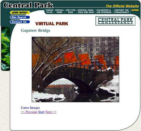
The Central Park Conservancy, which manages the park, has a "virtual tour" of the Gates up on their site - essentially a boring old slideshow, whose one redeeming feature is that it notes very specific geographical locations for each photograph. This suggests the possibility of mapping the archive (Mappr folks, we're hoping you can weigh in on this..).
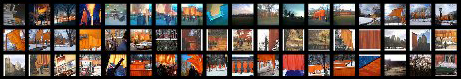
The last example I'll mention is simply a fun montage program we came across. Plug in "christo" and "gates" and you get something like this. It's worth mentioning because we should keep our eyes open for existing visualizations that could be applied to, or adapted for, our project.

Check out also this post on the Flickr blog about parodies of the Gates. And also this interesting analysis posted on the Flickr Central forum on "the emerging 'genres' when it comes to 'shooting the gates.'"
Again, please comment and refer us to other examples..
Posted by ben vershbow at March 10, 2005 4:04 PM
Comments
As far as parodies of the Gates are concerned, I think the Cheesy Gates are way better than the crackers.
Posted by: Harvey Silikovitz at March 10, 2005 11:41 PM
Most photographs taken with digital cameras, as many or most of the picture posted on flickr are, will have the time and date the picture was taken embedded in the photograph (in the EXIF data). It would be interesting to create a gates timeline to go along with any geographical data. One could then see which pictures were being taken at any given point during the 16 days.
If there was also geographical data involved one could depict the information on an animated map. Imagine little orange dots appearing on a map of central park each representing a picture being taken.
A flight of fancy on my part, to be sure, but not outside the realm of possibility.
Posted by: nick at March 11, 2005 4:31 AM
Or we could look at what time of day each image was taken at: so we could see all photos of the Gates at sunrise, for example.
Posted by: dan visel at March 11, 2005 5:47 PM